Conceptual Overview
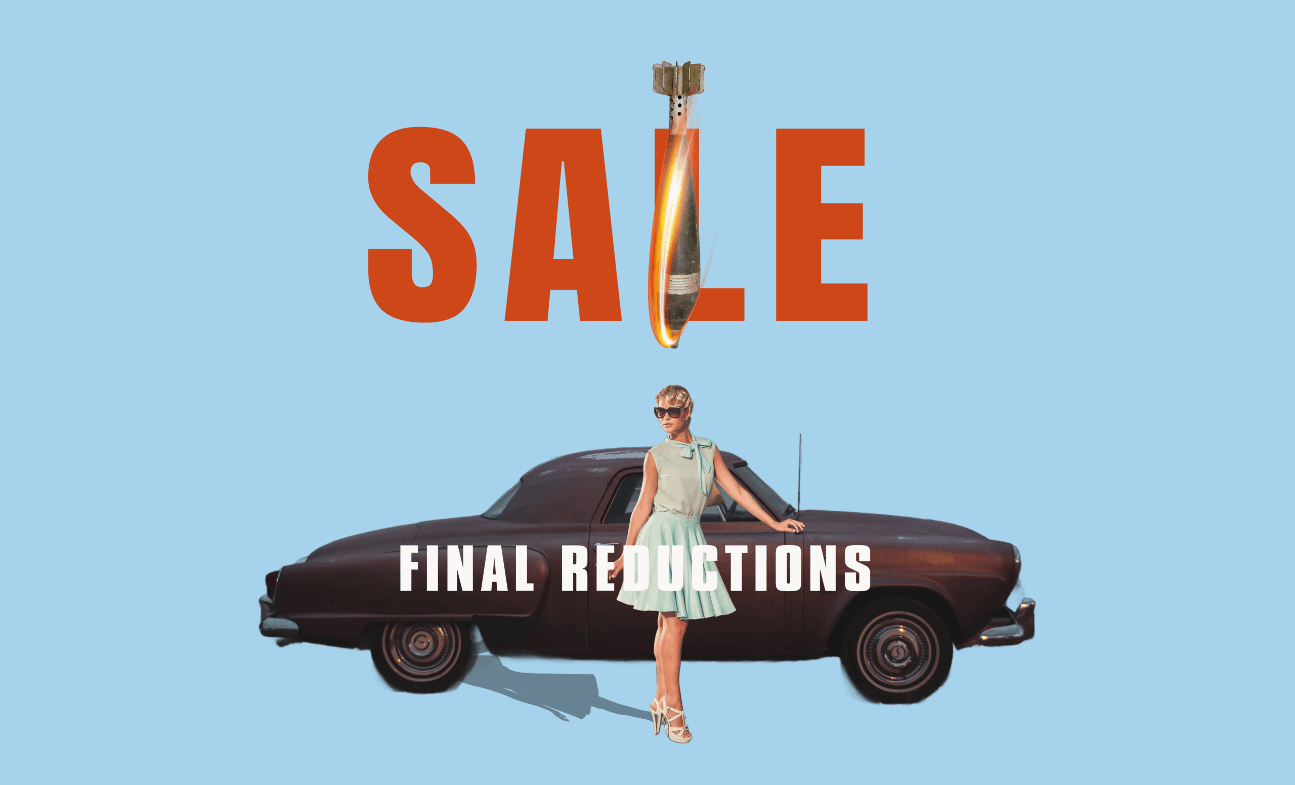
Final Reductions adopts the visual grammar of mid-century advertising – bold sans-serif typography, aspirational imagery, clean colour fields – but introduces a fracture. At first glance, it resembles a retro fashion campaign: the polished figure of a woman, perfectly styled in mint tones, poses beside a streamlined vintage car. Behind her, the sky is a pastel blue – a blank optimism.
But the image is unsettled. The word SALE dominates the composition, yet the “L” has a falling bomb superimposed. It introduces violence, urgency, and collapse—while the woman remains unbothered. Below, FINAL REDUCTIONS could be retail language or apocalyptic finality. It hints at end times dressed in department-store language.
Material and Visual Strategy
Though created digitally, this piece is designed for physical display—as a large-scale poster, billboard, or shopfront hoarding on a closed store. It plays with visual codes of marketing but subverts the viewer’s expectations. There’s no pricing, branding, or call to action. In fact, the absence of these elements makes the image feel uncanny. It’s too clean, too hollow.
In a way, it poses as an advert but fails to complete the transaction. Without a product or purpose, its message collapses into ambiguity. This opens up space for interpretation: is this an advert for fashion, or for war? Is this beauty on sale—or civility?
The lack of small print, disclaimers, logos or footnotes is intentional. These absences create a vacuum in which the viewer is left to question the authenticity of what they’re seeing. Where they expect reassurance or instruction, there is only a styled stillness.
Reflection
This work began as an experiment with visual nostalgia. I was interested in the seductive clarity of mid-century advertising: how it promised stability, aspiration, progress. But when those aesthetics are recontextualised—when a bomb drops into the middle of a sale—the illusion cracks.
Reflecting on it now, I see Final Reductions as a piece about passivity. The woman is elegant, poised, seemingly untouched—but destruction is already falling. It’s a meditation on the kind of cultivated indifference that aesthetic culture sometimes enables. A reminder that we often decorate the surface while ignoring the depth.
Going forward, I’m curious about pushing this ambiguity further. Would adding more “authentic” advertising elements—price tags, disclaimers, logos—make the critique sharper? Or would it dilute the unease? This work invites me to think more carefully about how visual language operates in commercial spaces—and how far I want to go in mimicking it before pulling the rug.